Thursday, May 26, 2022

Trending Colors: Sunset Blush

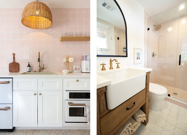
Joie Inn Blush Room kitchen with patterned backsplash.


What would a vacation be without a few surprises? For Ashley and Dino Petrone (@arrowsandbow on Instagram), that meant happening upon their next renovation project. Well-known upscale RV renovators on Instagram, the Petrone’s knew an inn was a natural step in the right direction. 

A four-unit motel, in need of plenty of love, tugged on the Petrone’s heartstrings and before they left Anna Maria Island, Florida, their offer on it was accepted. 

A few months later, the entire Petrone family left California for good and moved into the inn for the full-time renovation. Eight months later, Joie Inn opened up for business. Come with us on what is, for the most part, a journey through a color palette that defined the design at Joie Inn. 


Updating a Color Palette

Ashley turned to color for inspiration for the inn’s design. She wanted to remain true to the vibrant, beachy colors of Anna Maria, but breathe some new life into them. She turned to the more natural colors of the island: the sea grasses, sunsets, sand, etc. Sage, blush, sun, and terracotta colors are each featured in one of the suites at Joie Inn.

These warmer, softer colors are right on trend in today’s designs, but are also bold enough to play in the island atmosphere. Today, let’s take a closer look at the Blush Room inspired by the Anna Maria sunsets.


Collage of the the Blush Room kitchen and bathroom with white, blush, and natural wood palette.


The Blush Room

Every evening, when the sun sets over Anna Maria, the entire island is bathed in a blush from the sky. That’s what you’ll get all day in the Blush Room. It is the coziest room of the four at only 400 square feet. Though small, it features a king bed and a full bath and kitchen. 

The warming color is everywhere from the kitchen backsplash and the shower tile, to the bedding and decor. It’s like being enveloped in an island sunset—a perfect place to unwind.


Mood board with blush tile and corresponding paint colors and fixtures.


Why Blush?

Blush first made its appearance on the runways of fashion week a few years ago. It was a natural shift from the fashion industry to the interior design industry since blush is a soft neutral that does well in all settings. The rosy, barely-there color is one of the most flexible on the color palette. 

A neutral such as blush can be used liberally as a base color or it can be featured as an accent. It can be light and bright, or it can be soft and moody. It warms up any setting, even those that use gray or white as foundational colors. It invites other warm colors onto the palette where reds, oranges, beiges, and pinks can define the design. 

Blush is a color that does well in patterns too. Florals, geometrics, and block patterns all benefit from blush hues. Even hardware like sink faucets can feature a blush color. For instance, Ashley chose Champagne Bronze for the kitchen and bathroom fixtures by Delta. This rose gold-like tone makes an excellent metallic that complements the Blush Room’s design. 


Want to see more of Joie Inn and its on-trend, beachy color scheme? See more on our blog. 

Check out the Sage Room

Thursday, May 19, 2022

Trending Colors: Warm Terra-Cotta

Close up of the kitchen backsplash with terra cotta tile and champagne bronze sink faucet.


The Petrone family (@arrowsandbow on Instagram) never expected to find their next project while on vacation on Anna Maria Island, Florida. Already pros at flipping RVs, when a rundown inn on the island caught their eye, it was natural to see it as a potential project. 

They put in an offer and had secured the four-suite inn before their vacation was over. In a matter of months, they were onsite working. It wasn’t long before the inn was complete and open for business. Ashley and Dino Petrone’s vast Instagram audience loved watching “Joie Inn” come together from start to finish. 


Aiming for Warm & Family Friendly

What drove the entire project, and what often drives the Petrone’s projects, was their own family. Ashley focused on creating suites that her family could enjoy. She ensured every element was kid friendly and provided details that would make the space immediately feel comfortable. 

Ensuring the design was warm and inviting was the first step and color played heavily into that. Ashley wanted a design that reflected the beach community with its bright, happy vibe but also wanted to give it an update. The result was four warmed-up and trending colors that formed the foundation of the design for each room. Each room is named for its feature color. Today we look at the largest of the suites.


Collage of the kitchen and bathroom in the Terra Cotta Room at Joie Inn.


The Terra-Cotta Room

The color terra-cotta blends rose, orange, and brown into one color that oozes warmth. Ashley chose terra-cotta because it reflected the sunsets, soil, and overall vibe of the sun soaked island. The color gives a nod to the traditional island palette but has a sense of freshness as well.

The room is 750 square feet, the largest unit, and the color terra-cotta is all over from the shower tile and kitchen backsplash to the bedding and decor. Splashes of terra-cotta even make an appearance in the terrazzo floor tile.


Mood board showing terra cotta color palette.


Why Terra-Cotta?

While the inn was under construction, the pandemic was in full swing. People spent much more time at home and more than one homeowner found this the perfect time to do some renovating. With work, school, and play all happening at home, the cool, spare grays and whites so popular in design just weren’t enough. 

People craved warmth, coziness, a lived-in feeling in their surroundings rather than the minimal designs that most found themselves surrounded by. The first thing that changed in this new interior design atmosphere was color. 

Colors warmed up turning from grays to beiges and allowing many more warm colors and softened palettes with sage, blush, and . . . terra-cotta. The natural and muted red-orange-brown of terra-cotta once a favorite of the back patio came front and center. It instantly produces a sense of comfort and warmth.

Terra-cotta can also be used as a neutral color that blends into the background harmonizing a design with its steadying hand. Some of the most popular colors right now can have this same miraculous effect: working as either a feature color or neutral color. They include navy, warm charcoal, mustard, blush, and gray-green sage.


Ready for more Joie Inn trending colors? Keep reading.

Go to Trending Colors

Thursday, May 5, 2022

Trending Colors: Island Sage

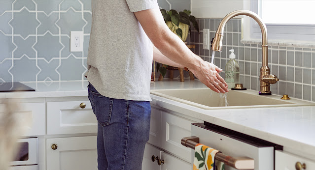
Man washing his hands in a white kitchen with sage tile backsplash.


On vacation on Anna Maria Island, Ashley and Dino Petrone never imagined that their play time with their family would spark their next project. The brains behind Instagram’s @arrowsandbow, Ashley and Dino had already completed several upscale RV renovations. 

When they happened upon a little inn on the island in need of some TLC, they knew what was up next for them. They put in an offer and it was accepted before the vacation was over. Eight months later, Joie Inn was born.


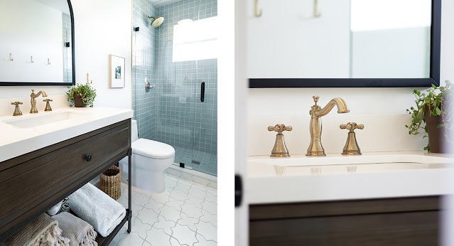
Joie Inn bathroom collage with sage tile in the shower and champagne bronze faucet.


Driven by Color

The story of Joie Inn is a story about color. Beach communities are known for their vibrant colors, and Ashley wanted to be a part of that, but she also wanted to give the colors a fresh update. She turned to the natural environment for inspiration. Sunsets, crashing waves, and sea oats defined the color palette inside Joie Inn as much as it did outside. 

Vibrant in a warmer, trendier way, the four colors Ashley selected were featured in one of each of the four suites. This updated vibe is youthful, welcoming, comfortable, and still reflects the beachy feel of the surrounding buildings on the island. 


The Sage Room

Named for its color scheme, The Sage Room is a large 700 square foot suite on the second floor that overlooks the pool. The gray green featured in this room is the same color you’ll find when you step outside and head down to the beach. 

Sea oats and rolling waves inspired the color choice and you’ll find it everywhere from the bedding and backsplash to the decor and throw pillows. 


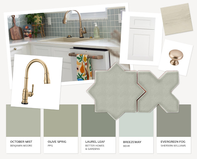
Mood board of sage colored things with champagne bronze metallics and accent colors.

Why Sage?

Sage is the hottest color of 2022. In fact, Minwax, Benjamin Moore, Better Homes & Garden, and Sherwin Williams all named it their color of the year. Why? It’s a flexible and warm color that can wear many hats.

Sage is a neutral color. The gray-green shade easily works as a blank canvas that makes room for other colors and patterns. It fades into the background in the same way gray or beige can but with a whole lot more interest. 

On the other hand, sage can also be a feature color that can easily be a center of attention. It’s a beautiful color for a statement wall, makes a lovely accent sofa, and can even play heavily in decor.

Warm colors are the new go to in today’s interior design color palettes, and sage is the champion color. Its soft green and warm greige influences create a welcoming ambiance and laid back personality that embodies everything that is the island of Anna Maria.

You’ll find sage in the bathroom tile, kitchen backsplash, bedroom linens, even sprinkled across the living area in incidental pillows and decor. It’s the perfect backdrop for a relaxing vacation that feels like home, only on the beach.


Want to learn more about the inn? Take a look.


Explore Joie Inn